Lancashire Life Magazine Feature
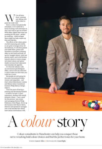
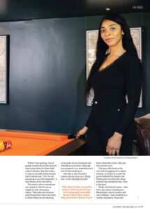
Philip Martyn Design have recently been featured across 3 pages in the famous Lancashire Life publication.
Here’s a quick extract –
We’ve all been there, umming and ahhing over what colour to paint the walls with.
Red is a colour that physically stimulates, so it’s useful for a boost of energy and motivation in that ‘can’t-wait-to-get-out-of-here’ WFH office; lighter blue tones are soothing for the mind — perfect for studying — while stronger blues might just help conjure up that next big idea.
The effects of the colour green can feel reassuring and restful, so are great in lounge areas; for the bedroom, it’s all about pastels and subtle blues, greens and lavenders to promote a relaxing effect on the mind and body (or opt for ‘snuggle colours’, pink and peachy tones), and in the kitchen, natural colours or warm orange, red-tinted colours and spicier shades increase food enjoyment and stimulate the appetite.
It’s what the industry calls an unconscious psychological effect, and it’s all to do with how a colour makes you feel when you walk into a room. But people are still opting for the more conventional whites, creams and magnolias… and that’s where Manchester, London and Miami colour consultancy business Philip Martyn Design steps in.
To find out more visit Lancashire Life Magazine